The Illumience Hub: 3 Ways Enhanced Data Delivers Improved Power System Management and Real Cost-Savings

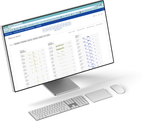
To provide reliable wireless off-grid or hybrid power to mission-critical infrastructure around the world, data is paramount. As discussed in a previous blog post, the ability to remotely manage power systems is what delivers critical cost-savings as well as reliability and uptime assurance. Advanced cloud software tools are essential for remotely managing power systems. Clear Blue’s latest addition to the Illumience Platform, The Hub, delivers an enhanced data experience, ultimately allowing for more intelligent management of off-grid systems. Let’s dig deeper into what the Hub has to offer.
History of The Hub
First, let’s step back and explain why The Hub was created. Clear Blue’s Illumience cloud management platform was originally designed to remotely manage solar streetlighting systems. With the deployment of multi-controller power systems for large off-grid and hybrid telecom sites, there was an opportunity to improve the user’s data experience, and improve the ability to understand the performance of not only power system as a whole, but also its individual devices. The Hub allows users to view multi-controller system data in a seamless, and customizable way.
So what’s different about The Hub?
Increased Flexibility for Multi-Controller Systems
With the Hub, users can monitor their entire system, while maintaining the ability to zoom into data on the device level and individual port level (including data on grid connect and genset). Therefore, data in the Hub is highly flexible, helping to understand system performance in a much more comprehensive way.
Example 1: System Overview and Filtering
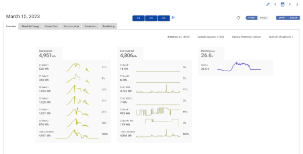
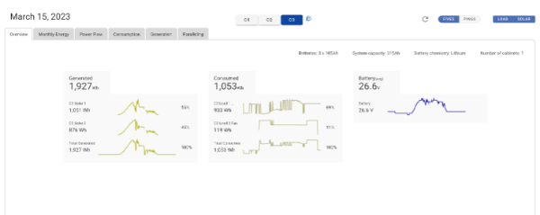
In The Hub, the Overview tab shows users how the system is performing on a basic level. It shows system energy generation and consumption, and battery voltage. Beyond that, it also then breaks down energy generated by each solar panel and energy consumed by each load in every individual controller. The ability to flexibly view data from these different angles (the system level and the controller level) is an extremely powerful tool.
Example 2: Precisely tailor data in The Hub
The Hub is where you go to see all your system’s data, whether the system is an Illumient streetlight with one controller, or a Nano-Grid system with 20 controllers. In The Hub, the ability to select and unselect exactly the data the user wants to see makes managing multi-controller systems much simpler. As you can see above, users can select or unselect whichever data points they need to see. From there, users can easily detect patterns in solar panel shading or soiling, and the charging and discharging cycles of the batteries, to understand precisely how the system is behaving. The Hub allows users to harness data to manage systems more effectively.
Increased Data Customizability and Visualization
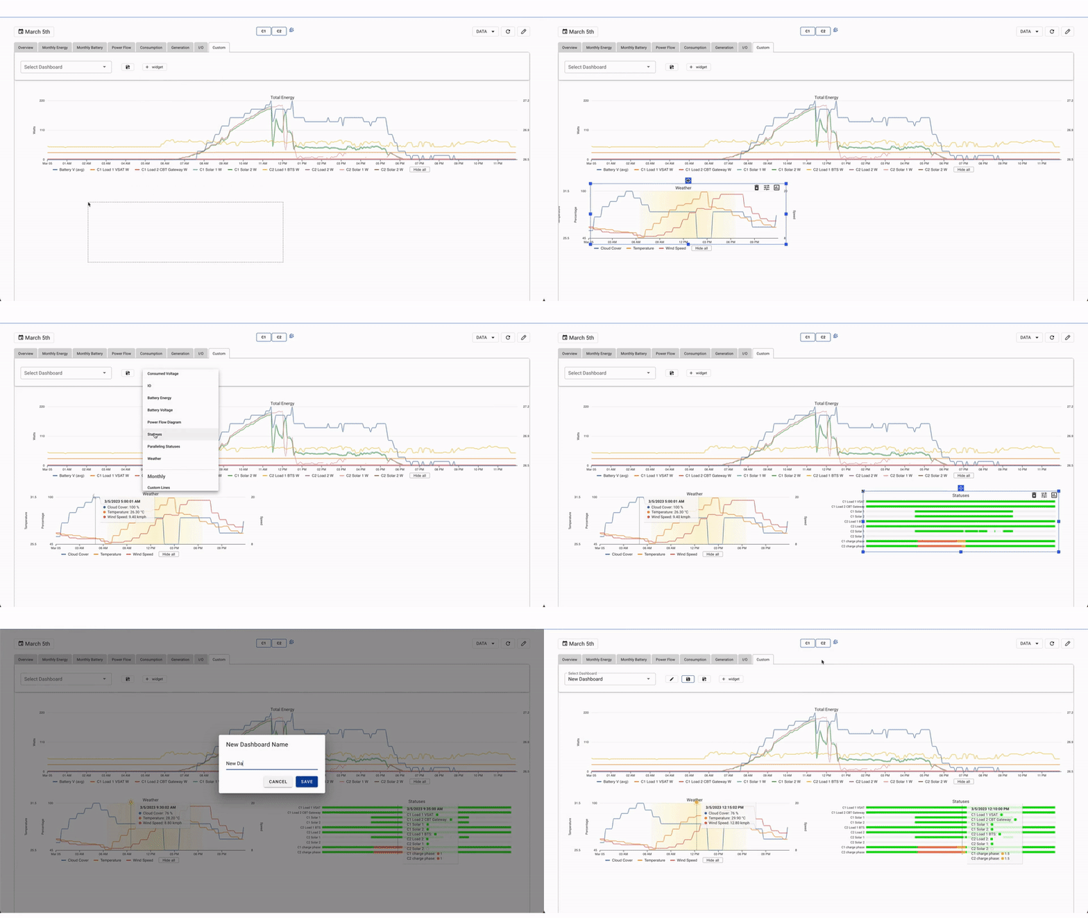
The Hub provides a highly customizable data experience, helping users better understand their specific needs and solve specific problems. In The Hub, users can personalize how they view system data to better understand system performance.
Example 1: Custom Charts and Graphs
The Hub allows users to build their own picture with the data by allowing for custom charts to be created. If users want to dive deeper into a specific aspect of their system, such as how energy consumption affects battery charge phase, or how weather affects power uptime, custom charts can be built to view and analyze those specific problems. The more ways in which system data can be visualized, the more intelligent remote power system management will be.
Example 2: Play with data in a wide variety of date ranges
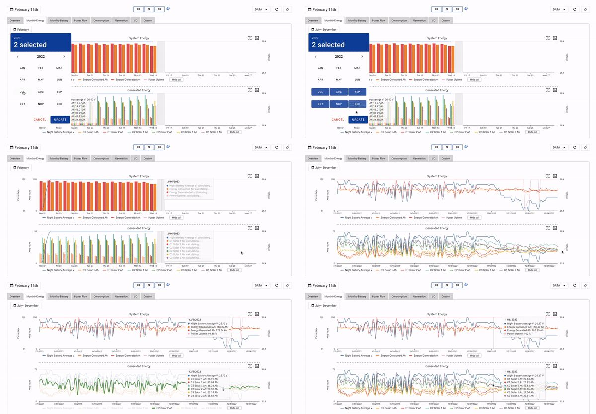
In The Hub, system data can also be displayed by any date range, which is extremely valuable. Data can be viewed by the day, to understand a specific event at a particular time of day, or by months or year to understand long-term system performance trends. This way, users can detect patterns in their system where, in certain times of the month, their energy generated decreases when consumption increases. Users can then draw correlations with weather, solar panel shading, and battery charge phases. The ability to customize how system data is viewed allows users to develop a more comprehensive picture of the system’s historical health, which informs smarter system management.
Deeper Data Insights, Intelligent System Performance Management
In addition to the data customizability offered by The Hub, there is new functionality which delivers better insights, and intelligent system management.
Example: Detect Solar Panel Shading
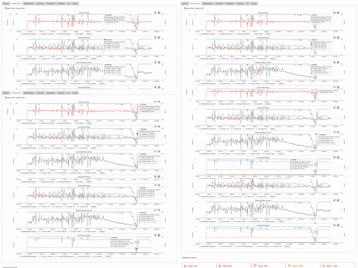
For instance, as seen in the image below, insights through The Hub allow users to catch solar panel shading, or dusting very easily. Users can see when energy generation should be high due to weather, but the generation of specific solar panels is low as a result of shading issues. As seen in the clip below, solar panel current is highly variable when energy generation is high, but when the panel becomes shaded, the current flattens out and drops. With the ability to correlate with battery charge phases, users can then see how solar shading is affecting battery charging. Therefore, data visualization in The Hub offers deeper system insights to catch problems before they compromise the system's uptime performance.
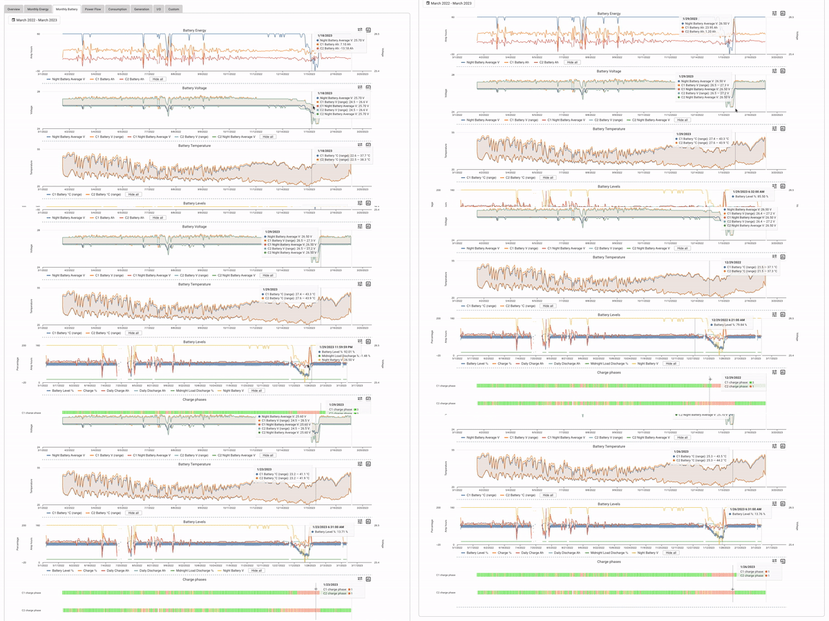
Ultimately, the Hub provides a new set of tools for users to understand system performance in a more comprehensive way. By providing increased data flexibility and customizability with multi-controller systems and deeper insights, The Hub delivers an improved data experience. As a result, The Hub provides the tools for more intelligent power management. Intelligent power management and control delivers both CAPEX and OPEX savings, as well as the highest reliability on the market.


